Brushstroke Text Effect in CorelDRAW
June 22, 2009 at 6:51 am | Posted in CorelDraw | Leave a commentTags: Brushstroke Text Effect in CorelDRAW, CorelDraw
This is a very easy way to add a splash of color to text or plain clipart. We’ll use the Artistic Media Brush to paint strokes of color behind an outline font. The artistic media tool was introduced in CorelDRAW 9. I’m using CorelDRAW 11 in these screen shots, but the steps should be the same for version 9 through 12.
1.) Select the type tool, then click onto your page and type to create some artistic text.
2.) Change the font to a somewhat bold font. I’m using an outline font called Monstroula Shadow. Outline fonts work well, but if you do not want to use an outline font, you can set the fill to none and add a thick black outline.

3.) Go to Tools > Object Manager and add a new layer. Name the Text layer “Text” and the new empty layer “Paint”.

4.) Drag the paint layer under the text layer and make sure it is active. The active layer’s name will be shown in red.
5.) Zoom into the text so it fills your screen.
6.) Select the artistic media tool, and then the brush option. It is the second icon on the property bar.
![]()
7.) From the menu of brushes on the property bar, select the brush called oil1.
8.) Use a blank space in your document and click and drag to paint a sample brushstroke across the page. As you paint, the stroke will look like a black blob, but as soon as you release the mouse button, it turns into the brush stroke you selected in the property bar.

9.) Go to the property bar and adjust the brush width ![]() until it matches the text you’ll be painting. You can delete this test stroke once you have adjusted the width.
until it matches the text you’ll be painting. You can delete this test stroke once you have adjusted the width.
10.) Now simply trace each character of your text just as if you were writing it. it may help if you have a graphics tablet, but you should be fine with a mouse if you zoom in close enough.
11.) Don’t worry about staying in the lines; the sloppy, painted look is what gives this effect its character. This particular brushstroke gets wider at the end of the stroke, so you may want to keep that in mind as you trace over the text.

12.) Once you have painted each character, you can go back,select each stroke and change the colors. You can also experiment with some of the other brush tool presets. By selecting the shape tool, you can manipulate your lines so they follow the text more closely. Here’s how mine looks after changing the colors and fixing up the lines a bit.

Here is an example using a different font and different preset brush strokes for each letter.

13.) It may help to make the text layer uneditable in the object manager while you are manipulating the brush strokes. This will prevent you from accidentally moving the text. To lock a layer, click the pencil next to the layer’s name in the object manager.
14.) You can even hide or delete the text outlines for another look.


Designing a Typographic Concept Poster
June 21, 2009 at 3:29 am | Posted in GrApHiX, PhOtOsHoP | 1 CommentTags: Designing a Typographic Concept Poster
Step 1
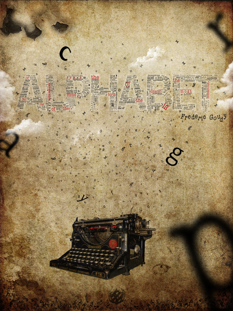
The first thing that came into my head when I heard about the typography contest was a typing machine, so I started from that. I have provided each link for all the stock I used. Then, after a few days of trying to figure out how to continue, I started adding letters to the document. As I continued experimenting with the letters, I decided to add them into the design to construct a quote out of them (see the red text in the design).
First of all, you need to open up a new document. The size I chose for the tutorial is 768 pixels by 1024 pixels. The poster I did for the contest is a little bit different from the one in this tutorial, but both have similar concepts and techniques used.
Step 2
Now I will use two vintage textures. I would like to thank the author of these textures Princess-of-Shadows for putting these together. They are amazing! You can experiment with other textures or backgrounds if you like.

Step 3
In this step, you will need to move both textures into your document and fit them. You can scale them if need be. Next, finish positioning them one on top of another. You will need to select the one you placed above and set it to Multiply. This will blend the two textures together.

Step 4
Next, I will import another stock image. You can find this image at wilddoug. Simply use the Magic Wand Tool ![]() to remove the white around the typewriter or use the Pen Tool (P). Lastly, name the layer “Typewriter.”
to remove the white around the typewriter or use the Pen Tool (P). Lastly, name the layer “Typewriter.”

Step 5
Set the “Typewriter” layer to Multiply and Opacity to 90%.

Step 6
Now, duplicate the “Typewriter” layer and set it to Soft Light and Opacity of 30%.

Step 7
Next you need to create some text. The font I used is Arial. Just write your text with white and also make it all caps, then transform the text as you wish. Also, set the layer to Soft Light and Opacity to 50%.

Step 8
The next step is the hardest or maybe I should say it takes a lot of time to get this to look just right. You will have to write a lot of words and move each word into each letter of the “ALPHABET” word. You are free to position and transform the words as you wish. Also, the font used here is called American Typewriter and I moved all the words into a folder called “ALPHABET.”
As you can see, I have colored some of the letters with red. I did this to highlight the quote I told you about. Also, to give a greater impact to the effect, if you look in the lower side of the letters, they seem to be falling down. This adds more movement to the composition.

Step 9
The final result so far should look like the image below.

Step 10
Now you need to add some more text. This time you will make it look like it jumps right out from the typewriter. Don’t create full words, but only letters. For example, I start with the letter “a”, and duplicated it a couple of times, then transformed each until it fit right. Next, I went to the next letter “b” and so forth. In the end move all the letters to a folder called “Text.”
The red lines represent the area where you should place the letters for maximum impact, so it looks like the letters are jumping out of the machine. This unifies the typewriter image with the lettering in the sky.

Step 11
You will need to repeat Step 10, but this time add less letters and make them smaller. Now, rasterize all of them , then go to Filter > Blur > Gaussian Blur and use a Radius of 1.0 pixels. This will give the illusion that the letters are further away.

Step 12
Create six more letters. This time make them larger then the rest. Next, transform them using the Transform Tool (T). Now Rasterize them all. Also, you will need to select three of them (or as many you like) and go to Filter > Blur > Gaussian Blur and use different Radius for each. This will give the illusion that these letters are closer.

Step 13
To make the letters look like they are high in altitude, I create a new layer and brush some clouds over the text. Here is a link for some fine cloud brushes on DeviantArt.

Conclusion
Add more letters in the lower part of the image, as this makes a nice border. Also, paint some more brushes (fly, crack on the upper left part of the image and a splat). You will need to paint these with black and set them to Multiply. Visit the User Link Feed for free resources. You can view the final image below or view a larger version here.
Create an Awesome Grass Texture in Photoshop
June 20, 2009 at 8:22 am | Posted in Uncategorized | 2 CommentsTags: Create an Awesome Grass Texture in Photoshop
- Bring up Photoshop and create a new document at a size that you like. I used 500px by 500px
- The first thing we need to do is make a dirt background to show through from underneath the grass we will create. Set your foreground and background colors to black and white. A shortcut for this is to restore Photoshop’s color defaults by pressing ‘d’ on your keyboard
- Rename the background layer you are working on, call it dirt, or something applicable. (We will be using a couple layers in this tutorial so this will help organize things.
- Go to the toolbar at the top and click filter->render->clouds. This will give us a nice base to work from.
- Add some noise and interest to our dirt. Click filter->noise->add noise. Change the amount to 44%, the distribution to gaussian and make sure monochromatic is checked on. (All these types of settings are merely suggestions, it’s by tweaking these settings, that you will really begin to get a grasp on Photoshop filters.)
- Add a gaussian blur to the dirt layer. Click filter->blur->gaussian blur. Set the radius to 0.9 pixels.
- Let’s add one more filter to this dirt layer. Click filter->brush strokes->splatter. Set the spray radius to 21 and the smoothness to 2.
- Now we need to give the dirt layer it’s color. Click image->adjustments->hue/saturation. Make sure to check preview and colorize. Then change the setting to a nice brown. I used: Hue: 49, Saturation: 29, Lightness: -38. Click OK.
- OK, we are now finished with the dirt layer. That gives us a nice texture and color underneath the grass we are about to create. Let’s start on the grass. Create a new layer and name it “Grass.”
- Change your background color to a grassy color green, I used, #52782F. Hit ‘ctrl, backspace’ to fill your current layer (Grass) with the green color you selected.
- Add some noise to your new grass layer. Click filer->add noise->noise. Choose 30% for the amount, gaussian for the distribution, and check monchromatic. Click OK.
- Blur the grass layer. Click filter->blur->gaussian blur. Change the radius to 0.9 pixels, click OK.
- We are getting closer, but it still doesn’t look a whole lot like any grass I’ve ever seen. We can use a couple of wind filters to lengthen the grass and simulate the look of blades. Click filter->stylize->wind, and change the settings to: method, stagger and direction, from the right. Click OK.
- That looks a little better, but grass doesn’t grow all in one direction. So we need to add a little more direction and interest to our layer. First click image->rotate canvas->90 CW. Click OK.
- We are going to repeat the last two steps now, but go in the opposite direction. So go to filter->stylize->wind again and choose stagger, from the left. Click OK.
- Now flip the image so the grass looks verticle. Click image->rotate canvas->90 CCW. Below is what I’ve got so far…
- I think this grass could use a little more contrast. Change the levels by clicking image->adjustments->levels. Drag the white and black sliders towards the middle till you get the variance you are after. Click OK.
- This is already a pretty useful grass texture, but we are going to take this tutorial a bit further. If all you need is the grass, you may want to jump down to the steps on masking to reveal some of the dirt layer underneath. Otherwise, stick with these steps to add some lines to our field of grass to make it look like a football field. First off create a new layer, make sure you add it to the top of the layers (ie above Dirt and Grass), and name this layer Lines.
- Grab the brush tool (’b’ is your keyboard shortcut). Open up you brushes palette, window->brushes. Locate and click on your watercolor loaded brush 63 (shown in the image below). This is a cool Photoshop brush with some rough edges.
- Change your foreground color to white. Start somewhere in the bottom left and click and drag toward the right side. You may have to try a couple times (if you are like me) to get a straight enough line. If you mess up just hit ‘ctrl, z’ on the keyboard to undo the brush stroke you drew.
- Use the same brush but scale the width down to about 45 pixels, either by pressing the ‘[’ on the keyboard or locating the size options in the properties box at the top for brushes. Make a line perpendicular to the first line you drew, going from that line to the bottom right hand corner.
- Add noise to the lines. Click filter->noise->add noise. I used 11% for the amount.
- We should make the lines look like they are painted into the grass so we are going to add a subtle inner shadow. Double-click next to the name in the layer palette (if you are following along it should be lines), this will bring up the layer style dialog box. Check inner shadow and change the opacity to 60, the distance to 4 and the size to 4. Click OK.
- The lines are starting to make sense on the field, but let’s try to blend them even more so. Change the opacity to 90 and the fill to 95.
- Now we are going to put the 50 yard marker on the field. Click on the text tool and in the properties for the text tool at the top of the screen, change your font to a stencil type font. I used ’stencil std’ but you can use whatever you think works best. Just a quick side note, their are many really good free font sites out there, one of my favorites is www.dafont.com. Change the font size to something like 72 (we can adjust the size later) and the color to white. Now click anywhere on the field itself with the text tool still selected. This will create a new layer at the top of the layers for us. Now type 50.
- Hit ‘ctrl, t’ on the keyboard to bring up the free transform tools. Hover over the middle of the 50 and click and drag it into the correct area. Then resize it to your liking by clicking and dragging any of the corners out (if you’d like to keep the proportions hold shift down while you drag). Finally, rotate the angle to the way you’d like. Hover over a corner until you get a double arrow with an arch for the curser, then click and drag.
- Convert the 50 layer to a smart object by right clicking (ctrl click on the mac) on the layer and selecting convert to smart object. This will allow us to handle this layer just like the others, in this case we need to add a filter. Keep in mind that once you convert a text layer to a smart object you lose the ability to change the text.
- Now we add the same amount of noise to this layer as we did with the lines. Because the last filter we used was noise, all we have to do is click filter->add noise
- Next up, we need to put the inner shadow on the 50 layer. Right click on the Lines layer and choose copy layer style. Then right click on the 50 layer and choose paste layer style. This will copy and paste the same layer style properties to the 50.
- That looks pretty cool, but their are a couple more things we can do. First off, we still have a dirt layer underneath, that we’d like some part of showing through. Let’s put all the layers besides the ‘Dirt’ on their own. Click on the 50 layer, then with the shift key held down click on the grass layer to highlight everything but the dirt layer. On the keyboard hit ‘ctrl, shift, alt, e’. This will place all these layers on top by itself. Rename this layer ‘Field’. Then hide 50, Lines and Grass layers by clicking on the eyeball icons near each one. All that should be showing now is ‘Field’ and ‘Dirt’.
- Add a layer mask to the ‘Field’ layer, by clicking the mask icon at the bottom of the layers palette.
- Now we will paint on the layer mask to reveal some of the dirt layer underneath. Change the foreground color to black. (Black reveals and white hides).
- Grab the brush tool again and open up your brushes window. Now click on the small arrow shown below to reveal all your brushes you have. Grab your favorite grunge brush set and click OK. If you don’t have grunge brushes, you can play around with what may work. However, I would suggest you head on over to bittbox, deviantart or brusheezy to find some grunge brushes you can use, they will come in handy often. Then place the brushes into your Photoshop brushes for use, you can learn some more about that and creating your own in this article.
- Now that you have a grunge brush you like begin painting black on the mask of the ‘Field’ layer to reveal the dirt layer underneath. Subtle dabs here and there work best, don’t overdo it, however if you do, you can always paint white back on the layer mask (which is the joy of using them :))
- Their is one more thing I did on mine to help the overall feel of a field with lights, and that is a nice lighting effect. Click back to the field layer, not the mask, and click filter->render->lighting effects. The defaults for spotlight aren’t bad, but play around with the sliders and the spotlight thumbnail on the left side. When you like the preview click ok. Below are the settings I used.


Realistic Crack
June 15, 2009 at 1:37 am | Posted in GrApHiX, PhOtOsHoP | Leave a commentTags: PhOtOsHoP, Photoshop Tutorial, Realistic Crack
This Photoshop tutorial shows how to create a crack in a stone texture. You will learn how to create a crack with variable thickness and you’ll create shadows and highlight without using a layer style. We will also explain how a layer set/group can be used to our advantage.
1. Adding the crack (highlight) |
In this Photoshop tutorial we’re going to use the following image:

You can save this image in Windows on your hard drive by right clicking on it and selecting Save Picture As…
(I don’t own a Mac, so I don’t know what the procedure is on a Mac).
Select the Pencil tool ![]() in the tool bar and choose a master diameter of 1 px by opening the Brush Preset picker window in the option bar:
in the tool bar and choose a master diameter of 1 px by opening the Brush Preset picker window in the option bar:
![]()
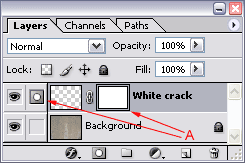
Create a new layer by clicking on the Create a new layer icon ![]() at the bottom of your layers palette and rename it to White crack by double clicking on its name in the layers palette.
at the bottom of your layers palette and rename it to White crack by double clicking on its name in the layers palette.
Press the letter D on your keyboard to make the fore- and background color black and white.
Press the letter X on your keyboard to switch the fore- and background color; the foreground color is now white:
![]()
We’re now going to draw the crack.
While holding down the left mouse key start in the top/left corner and draw a crack over a distance that’s about 1/5 of the final size of the crack. Once you’ve reached that point, release the mouse button but don’t(!) move the mouse, press the right bracket key ] on your keyboard once, to increase the master diameter of the pencil with 1 pixel and continue where you left off. Stop at 2/5 of the total length of the crack, release the mouse key again, press the right bracket key ] to increase the diameter another 1 pixel and continue drawing the crack.
At 3/5 of the distance you continue by using the bracket key [ instead to decrease the diameter to 2 pixels and you repeat this again at 4/5 so that you draw the last part of the crack with a diameter of 1 pixel.
The result could be something like this:

Make sure that you draw a random line with some sharp corners, a few bends and some straight parts.
At this point the beginning and ending of the crack stops too abrupt. We’re going to fix that by using a mask.
Add a mask to this layer by clicking on the Add layer mask icon![]() at the bottom of the layers palette.
at the bottom of the layers palette.
At that moment the mask is the active area (notice the double border and the mask icon ![]() in front of the layer (A)), so any further edits will take place on this mask only:
in front of the layer (A)), so any further edits will take place on this mask only:
Grab the brush tool ![]() in the tool bar and select a soft brush with a diameter of 40 in the option bar:
in the tool bar and select a soft brush with a diameter of 40 in the option bar:
![]()
Set the opacity of this brush in the option bar to 25%:
![]()
Make sure that your foreground color is black: ![]()
Now paint with black over the edges of the crack to make them fade (more transparent).
Use the following before & after rollover image as a guideline:

Continue by changing the blending mode to overlay in the layers palette and select an opacity of 75%
2. Adding the crack (shadow)

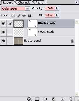
Press Ctrl + i (Command + i on the Mac) to invert the crack; it will now be black.
Important: the crack won’t look black when you look at it in your document window, since the layer’s blending mode is still set to overlay and the opacity is still 75%, since both were copied when we duplicated the White crack layer.
Change the blending mode of the Black crack layer in the layers palette to Color Burn, set the Opacity back to 100% and select a Fill of 85%:
With this layer selected, grab the Move tool ![]() in your tool bar and press the cursor right key
in your tool bar and press the cursor right key ![]() on your keyboard only once, then press the cursor up key
on your keyboard only once, then press the cursor up key ![]() also only once.
also only once.
At this point you should have something like this:

Notice that by using this method we’re blending the shadow with the actual texture of the wall, which results in fine visible details inside the crack which makes it all look slightly more realistic.
We’re now going to do a little trick to get rid of both identical layer masks, to end up with only one.
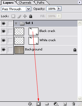
First click on the Create a new set icon![]() to create a new layer set (in Photoshop CS2 called a layer group).
to create a new layer set (in Photoshop CS2 called a layer group).
Now click on the mask that’s attached to the Black crack layer, hold down the left mouse key, move your mouse cursor until it’s on top of the Add layer mask icon![]() and release your mouse button:
and release your mouse button:
This will copy the layer mask that was attached to the Black crack layer to the layer set, since the layer set was the active layer at that time.
![]() In Photoshop CS2 we can duplicate a mask by holding down the Alt key (Option key on the Mac), click on the mask and drag and drop it onto the target layer:
In Photoshop CS2 we can duplicate a mask by holding down the Alt key (Option key on the Mac), click on the mask and drag and drop it onto the target layer:
Next we’re going to remove the masks of the Black crack and White crack layer by dragging (A) each mask to the Delete layer icon ![]() at the bottom of the layers palette. When asked “Apply mask to layer before removing?” simply click on the discard button:
at the bottom of the layers palette. When asked “Apply mask to layer before removing?” simply click on the discard button:


After removing the masks, continue by dragging the Black crack layer (B) to the layer set.
Do the same for the White crack layer (C).
Note: don’t drag the White crack layer first and after that the Black crack layer because then you end with the White crack layer as the first layer in our set, which is of course not what we want.
Continue by double clicking on the Set’s name and rename it to Crack:

I’m showing you all this to understand some of the advantages of layer sets/groups. At this point we can easily drag the crack around without having to worry about linking them. We can also easily drag the crack to a different document if we prefer to do so, because it’s now just a matter of dragging the set/group instead of the individual layers. We can now also easily hide the crack by simply clicking on the eye ![]() icon in front of the layer. Of course if we have multiple cracks it’s going to be a lot easier to keep the layers palette less cluttered when they’re all in one set/group.
icon in front of the layer. Of course if we have multiple cracks it’s going to be a lot easier to keep the layers palette less cluttered when they’re all in one set/group.
The other advantage, especially for this tutorial, is that we now have a single mask, which allows us to make a single change that will affect both the black and the white crack, which is important if we want to make the beginning or ending part of the crack fade away.
So go ahead, if you want to make some final adjustments to the mask, do that right now.
In the end we should have something like this:

Create the 3D text
June 7, 2009 at 5:53 am | Posted in GrApHiX, PhOtOsHoP | Leave a commentTags: Create the 3D text, Storybook
The first thing to do is get this free font called Storybook. It’s a font that fits our context well, and that will look well with 3D decorations due to its elegant serifs and bold stature. Type up the first letter of your word and give it this color: 4C3F38.

Now add a 3D effect by going to Effect > 3D > Extrude & Bevel. Play around with the settings yourself to get the angle, lighting and form you want. You can recreate my treatment by using the same settings. Don’t forget to use a ‘Complex 2’ Bevel.

Once you finish the first letter, repeat the process on the remaining letters. The only modifications you should make are to alter the position. Then copy (Ctrl+C) each individual letter and paste (Ctrl+V) them in Photoshop one at a time. Once you try pasting them, you’ll be prompted to choose a method of importing. Choose the ‘Smart Object’ Option. By doing this you can make simple adjustments at all times to the Illustrator file right inside Photoshop by double clicking the layer icon.
Position the letters onto an empty Photoshop canvas. I’m working at a rather large resolution of approximately 6300 x 4500 px at 300 ppi.
Also, fill the background layer with this color: 17151d.

At this point we’ll begin stylizing the letters. Get the Magic Wand Tool ![]() and make a selection of the letter’s foreground. Right click, select Make Work Path and specify a tolerance level of 1,5.
and make a selection of the letter’s foreground. Right click, select Make Work Path and specify a tolerance level of 1,5.

Now that it’s a work path, we’ll fill it with a color by going to Layer > New Fill Layer > Solid Color. Fill it with white. The path should now be a vector shape. Double click on its layer and give it a bevel. Use the settings shown in the image below and choose the highlight color (94aa53) and shadow color (6c6f64).

It’s now time to create a pattern that will cover the front of each letter. I’m using a Go Media vector freebie: Seamless Swirls. Go on and download it if you haven’t already, and open the provided Illustrator file. Change its color to this: 94aa52 and copy (Ctrl+C). Open a new Photoshop project with the clipboard size (235 x 235 px) and fill the background color with another color: ebe77f. To make it into o a pattern go to Edit > Define Pattern. Your new pattern will be saved in the pattern set that is currently opened.

Now that you’ve created the pattern, you need to add the pattern to the face of the letter. Double click on the white shape’s layer and add a Layer Style: Pattern Overlay. Your newly created pattern should already be selected.

One last touch is a Gradient Map Adjustment Layer that we’ll place on top of the letter’s body. While having the layer selected, go to Layer > New Adjustment Layer > Gradient Map. Then play around with the colors until you get a similar result. My colors, from left to right are: d8c67f, 94aa53, 262628, and 141416. Make sure that the Adjustment Layer Applies only to the letter. To do this, make it a clipping mask for the letter layer by holding Alt and clicking right in between the two layers.

Now copy the layer style of the letter face and duplicate the Gradient Map. Apply these effects to the remaining letters.

Draw the scenery
The text is now finished. Let’s add the trees and foliage.
This technique I’m about to show you is what I have developed for myself. It reduces complex imagery to simple shape. A simple splatter, when grouped in a pattern begins to take a certain role, thus resembling an element of nature. You may find it useful or dull, but it’s what we’ll use for this design.
All you need is a standard Photoshop round brush and a mouse. Choose one using your Brush Tool (B) and input the settings found in the images below.


Now that your brush settings are all ready, begin painting a tree. It’s important to know that you shouldn’t create the whole tree with the same brush settings. There is one adjustment you need to make along the way. If you look under Shape Dynamics in your Brushes Window, you’ll see a setting we’re using: Fade. This fades out your brush depending on how much you put in the adjacent field. A Fade set at 100 will end faster than one set at 250. You can use whatever settings you find appropriate. I used 100 for the trunk, 150 for extensions of the trunk, and 250 for thick branches. As you increase the fade, reduce the brush size at the same time.

Continue using this technique in creating the rest of the trees and draw some roots too. Reduce the size considerably for the thin branches and add even more fading when necessary.


It’s time for foliage. Prepare a separate brush using these settings.


Now begin painting. Begin with a larger size using this green: 94aa53. In a layer underneath, with a smaller sized brush, paint with a darker green: 55612f. Again over the light green layer, use the same color (94aa53) with an even smaller size. For highlights, use the same size as the last one, but with this yellow: e3e07d. Here is an image you can use as a reference in creating your own trees.
I drew my inspiration from acacia trees, while coming up with the shape of the trunk and volume of the foliage.

Following the branches as a reference, draw away!

Add more nature elements now. I added a mountain and a moon. They will give depth to the image, and prevent the composition from being scarce. Use the pen tool (P) and create them as vector shapes.

Make the mountain fade out on the bottom. An easy way to do it would be to create a new layer on top, clip it to the mountain layer and paint with a large soft brush with the background color. I also added a glow on the moon. To add one yourself, add a layer style: Outer Glow. Keep the standard color, increase its size and reduce the opacity to 25%.
Some more improvements include adding dark accents to the lower part of the tree trunks and shadows that stretch across the face of the letters. You can create those in the same way – clip a new layer to the one you want darkened and paint with a soft brush using a dark color. This applies to the mountain, trees and roots. Use a sharp brush to draw the tree shadow though.

Finalize the design
In order to complete the artistic feel of this design, add this texture to your canvas. Simply paste it on a new layer, over all the other ones. Set the layer’s blending mode to Linear Burn and its opacity to 30%.

Now invert the texture (Ctrl+I) and change its hue by going to Image > Adjustments > Hue and Saturation. Change the hue to 153 and saturation to -73.

One last touch – add the watercolor texture inside the mountain and moon, once more, with clipping masks. Put their layers on Overlay (Mountain) and Multiply (Moon). Adjust the opacity.

And that concludes it. Now go on and create your own, one of a kind, dream design.

3D effects in Photoshop
June 6, 2009 at 12:00 am | Posted in GrApHiX, PhOtOsHoP | 1 CommentTags: 3D effects in Photoshop

Taking 3D objects into Photoshop is going to get more popular thanks to the latest release of Photoshop Extended. But you don’t need Adobe’s latest high-end version of Photoshop to create some unique 3D effects – this masterclass works for Photoshop CS and above.
In it, type-effects guru Nik Ainley shows how to create the above image. The key is to create the letters in a 3D package first as individual characters, then bring them into Photoshop for further post work.
Through clever use of Photoshop’s masking tools and layers, Nik has created type with characters that weave in and out of each other. The characters’ faces also provide a handy canvas for further effects, such as patterns, gradients and lines.

01. Start by producing each letter separately in a 3D program, which Nik did here in Xara 3D, and import them into a Photoshop document. Keep each letter in its own layer, and then arrange them around each other, in whatever way looks good to you.
It might seem odd to create 3D text in this way, but Photoshop offers a lot more control than a 3D program and you will be able to produce a larger than life effect. To save time, the PSD file with the 3D text is included on this issue’s CD.

02. One advantage of working in Photoshop is that letters can appear to be both behind other letters while having parts in front of them at the same time. To achieve this effect, you need to mask parts of individual letters to make it appear that they’re behind others.
To mask part of a letter, start by adding a layer mask to the appropriate letter. The next step is to select which letter you want to appear in front – in the screen above, we’re making the E appear as though it’s partly in front of the H.
Select its outline by Ctrl+clickingon its layer thumbnail. Using the brush tool, brush black onto the H’s layer mask. It should now appear that the bottom tip of the E is in front of the H. Repeat this for as many letters as you like.

03. Next, you’ll start working on the lighting and shadows, starting with adding shadows onto the F. Create a new layer above letter F. To make sure the shadows fall only on the letter, give it a mask.
The shape of the mask must correspond to the shape of the F, minus parts masked off in the previous step. To do this, Ctrl+click on the F layer’s thumbnail, then Ctrl+Alt+Shift click on the layer mask’s thumbnail to get the intersection of the two. Now select your new layer and add a layer mask. It should be the same shape as your selection.

04. Using a large soft brush – say 70px – brush black onto this layer around the parts of the letter that should be in shadow. In this case, the top bit that falls behind the R and the bottom that falls behind the S. Repeat this process for each layer and you should end up with a lot more depth.

05. With the shadows on the letters done, now we need shadow on the background. Create a new layer below all of the letters. Select the outline of all your letters, and fill it with black. Run a Gaussian blur on this layer. Now, use a Warp Transform to pull it downwards slightly so it seems that the letters are floating above the background. Blur again, and drop the layer’s opacity if the shadows seem too harsh.

06. Next, add some more-controlled shadows beneath the layers to give greater depth. Create a new layer above your first shadow layer and, using a soft 50px brush, add black into this layer. Where you add it is down to what looks good. Add more underneath the base of the letters to give the impression that they’re standing up vertically.

07. Now start working on the actual letters. The first step is to isolate the front face of each letter, using either the magic wand or pen tool. When you have a face selected, create a new layer above your letter but below the letter’s shadow.
Fill it with whatever colour you want, but make it slightly darker and duller. If you have masked off part of the letter in step 2, you will need to duplicate the letter’s mask to your face layer.

08. To style each letter face we are going to use layer styles. The exact settings are really down to personal taste, but the basics are something like this: Inner Shadow: Color dodge, white, opacity 15 per cent, distance: 0px, size: 45px Inner Glow: Screen, white, opacity 75 per cent, size 2px Gradient Overlay: Soft light, black to white, opacity 100 per cent, angled to make the letter lighter at the top, darker at the bottom. Satin: Color dodge, dark grey, opacity 50 per cent, distance: 20px, size: 40px

09. Once you have got something you are happy with we are going to start working on the sides of each letter.

10. Next, you need to change the colours and lighting of the sides, as well as get them to look more consistent with each other.
To do this, you need to use Photoshop’s adjustment layers. Start by selecting the outline of the F shadow s layer mask and creating a new gradient map adjustment layer just below the face layer.

11. Now it’s possible to stack additional adjustment layers above and below the layer created in step 10 to change the lightness, contrast and colours as much as you like. Next, copy the adjustment layers onto each other letter and go through making small adjustments to get a more consistent colouring.

12. To give a little extra gloss, run Filter > Artistic > Plastic wrap on the body of each letter with the settings Highlight strength 14, Detail 1, and Smoothness 14. After each filter is applied, fade it to a soft light blending mode (Edit > Face).

13. Now to bring all the colours together to give a more harmonious feel, add some adjustment layers right at the top of the image. Start by applying the same gradient map as before using a soft light blending mode at 50 per cent opacity.

14. Try different adjustment layers to get the right colours and balance. Add curves layer to lighten it, a photo filter layer to add more red, and a colour balance layer to add more orange.
Add as many or as few as you like to get the effect you want. As a final tweak, mask all these adjustment layers so that they didn’t have so much of an effect on the background colour.

15. From here you can do as much or as little as you want. Add more details to each letter, add more highlights and shadows, change the colours, whatever you can think of. This example has a few more details, but you can take it much further.
Smoke Type in Photoshop
June 5, 2009 at 5:34 am | Posted in GrApHiX, PhOtOsHoP | Leave a commentTags: Smoke, Smoke Type in Photoshop in 10 Steps
Step 1
Open Photoshop and create a new document, I used 1920×1200 pixels. Then apply a gradient, you could fill it with a gradient or apply a Layer Style. I used the layer style, Gradient Overlay. Use Radial for the Style and #07090a – #202b35 for the colors.

Step 2
Add some text in white then go to Filter>Blur>Motion Blur. Use 90º for the Angle, and 40 pixels for the Distance.

Step 3
Now go to Filter>Distort>Wave. use 3 for the Number of Generators, 10 and 346 for the Wavelength, and 5 and 35 for the Amplitude.

Step 4
Go to Filter>Blur>Gaussian Blur. Use 10 pixels for the Radius. Then group the layer and rename the folder’s Blend Mode to Color Dodge. You will get a nice light effect.

Step 5
Create a new layer on top of the others and go to Filter>Render>Clouds, make sure you had black and white for the background and foreground colors, then change the Blend Mode to Color Dodge and go to Layer>Layer Mask>Reveal All. With a very soft brush, 0% hardness and black color, hide some areas of the clouds layer. Use the image below for reference.

Step 6
Create a new Folder on the Layers’ Palette. Change the folder’s Blend Mode to Color Dodge and add a new layer in it. Then use the Smoke Brushes from Qbrushes . Select white for the color and paint over some letters. If you think the brush is not very bright, just click twice.

Step 7
Paint a few more smokes like the image below.

Step 8
Create a new layer beneath the other layers but in front of the Background layer. Fill this layer with black and go to Filter>Texture>Texturizer. Use 100% for the Scaling and 4 for the Relief. For the Texture use Canvas and Light use Top. That will add a nice texture to the image but you will need to change the opacity to 10%.

Step 9
This is a nice new feature in the new Photoshop CS4, actually there’s nothing new just the Adjustments palette, but it’s very useful because you can edit all the image adjustments like Levels, Hue & Saturation, Curves in that palette. However it just adds a Adjustment Layer, that could be done in the previous versions too.
Anyway, on top of the other layers just add the Invert adjustment. You can go to Layer>New Adjustment Layer>Invert. It will be the same. You will get a very nice effect, like burning paper.

Conclusion
One of the best things in Photoshop is the Brushes Engine and all the things we can create with brushes. With so many excellent sites with Brushes like Brusheezy, Tutorial9, QBrushes, DeviantArt, and PSDTUTS we can find practically all sorts of effects and elements ready to be used in our designs. That means we can focus on ideas rather than figure out ways to recreate things. Also we have 2 very different effects with just one adjustment layer, the Invert. Once again, it’s all about playing. I hope you enjoyed this quick tutorial, and let me know if you have any questions.

Click here for full preview of the Dark version and here for the Light version
Photoshop Globe Design Technique
June 5, 2009 at 12:00 am | Posted in GrApHiX, PhOtOsHoP | Leave a commentTags: How to Create Photoshop Globe Design Technique, Photoshop Globe Design Technique
How to Create Photoshop Globe Design Technique
[1]-First of all Open New Document of Custom size,Height & Width 450×410 pixels,Resolution 72 & Mode RGB color

[2]-Now Open New Layer & then create the following selection with the help of Elliptical Marquee Tool

[3]-Now fill the selection with any color & then create the following selection with the help of Elliptical Marquee Tool &
then press DELETE & your image should look like as shown below

[4]-Now go to Blending Options,select Bevel & Emboss & use the following settings
Photoshop Technique-How to use the Bevel & Emboss feature

[5]-Now Open any image of World Map as I did take the following image with the help of Ctrl+O & adjust in First Document with
the help of Move Tool & after that rotate the map with the help of Ctrl+T & then press ENTER

[6]-Now Opacity of Map Layer should 50% & then create the following selection with the help of Elliptical Marquee Tool

[7]-Now press Ctrl+Shift+I & then press DELETE & after that Opacity of this layer should 100%

[8]-Now select Burn Tool ![]() & then create the following shading
& then create the following shading

[9]-Now select Dodge Tool ![]() & then highlight the some parts
& then highlight the some parts

[10]-Now Open New Layer & then create the following shape with the help of Pen Tool,right click select make selection

[11]-Now use the following settings in Make Selection

[12]-Now your image should look like as shown below

[13]-Now Fill the selection with any color & then go to Blending Options,select Stroke Structure & use the following settings
Photoshop Technique-How to use the Stroke Structure feature

[14]-Now your image should look like as shown below & then create the following selection with the help of Rounded Rectangle
Tool

[15]-Now Open New Layer & then fill the selection with any color & then go to Blending Options,select Bevel & Emboss & use the
following settings
Photoshop Technique-How to use the Bevel & Emboss feature

[16]-Now your image should look like as shown below & then create the other selection & then fill the same Color

[17]-Now Open New Layer & then create the following selection with the help of ‘Pen Tool’

[18]-Now fill the selection with ‘1f2021′ color & then go to Blending Options,select Bevel & Emboss & use the following settings
Photoshop Technique-How to use the Bevel & Emboss feature

[19]-Now create the following selection with the help of Polygonal Lasso Tool

[20]-Now select Dodge Tool ![]() & then create the following shading
& then create the following shading

[21]-Now set the 2pxl Brush size & then Open New Layer,Create the following shape with the help of ‘Pen Tool’ right click,select
Stroke Path

[22]-Now use the following settings in Stroke Path

[23]-Now like this Create the others & your image should look like as shown below

[24]-Now Open New Layer & then create the following selection with the help of Elliptical Marquee Tool

[25]-Now fill the selection with any color & then create the Other selection & then fill with ‘000000′ color

[26]-Now Open New Layer & then create the following selection with the help of Polygonal Lasso Tool

[27]-Now fill the selection with ‘909192′ color & then create the following shading with the help of Burn Tool

[28]-Now like this create the other lines with the help of Pen Tool.
Thanks for read this Photoshop Tutorial.I hope U have enjoyed & learnt some Photoshop Techniques & the Final Output of this
tutorial like as shown below

Tips For Working With Layers In Photoshop CS2
June 4, 2009 at 1:11 am | Posted in GrApHiX, PhOtOsHoP | Leave a commentTags: Tips For Working With Layers In Photoshop CS2
Tips For Working With Layers In Photoshop CS2
 There’s lots of brand new stuff in Photoshop CS2 and the following tips and tricks are just for this version of Photoshop. We’ll concentrate in this batch of tips on some changes that are making some people happy, and some people not so happy — and that’s the brand new way that Photoshop layers work.
The one thing that will impact migrating users the most is the way that Photoshop now selects content on a layer, as well as how Photoshop links your layers. Believe me, if you’re not prepared for this and are working on deadline and just can’t handle searching the help files, you will scream long and hard. Well, I know I certainly did.
How To Select Content In A Layer In Photoshop CS2
In previous versions, to select the content of a layer you would use the Control key (MAC: Command) and click on the name of the layer. In CS2 this no longer works. I repeat — this no longer works!
In CS2 you still hold down the Control key (MAC: Command) but now you have to click on the layer’s thumbnail (next to the eyeball icon) to select the content. You’ll get used to it quickly, but it’s a little counter-intuitive and frustrating at first — as most Photoshop brains will resist any attempts at being re-wired!
How To Select Multiple Layers In Photoshop CS2
This is a new improvement that will make selecting multiple layers a whole lot easier. Simply hold down the Shift Key and click on a layer in the layers palette, then while you continue holding the Shift Key just click on another layer. All the layers that are inbetween the two will now be selected, either from top to bottom, or from bottom to top.
 How To Add Or Remove Layers From A Multiple Selection
To add or remove layers from a multiple selection, hold down the Control Key (MAC: Command) and click on the layers you want to add or remove. This is a very simple and very efficient new way of doing things.
No More Link Column
The link column in the Layers palette is gone. To link layers together in CS2 you select each layer and then press the Link Layers icon (the little chain) at the bottom of the Layers palette.
Activating All Layers Or Similar Layers
To activate all the layers in your document go Select> All Layers. Or you can also just select layers that are of a similar kind, such as shape layers or adjustment layers. To do this simply Right Click (MAC: Control Click) on a layer and from the contextual menu choose Select Similar Layers.
Locking Multiple Layers
The lock icon at the bottom of the layers palette dims when multiple layers are selected, so if you want to lock a group of selected layers you must use the menu and choose Layer> Lock Layers. This is also available from the layers palette flyout menu.
Unlocking Multiple Layers
If you have multiple layers that are locked and you wish to unlock all of them at once, first target each layer, then choose Layer> Lock Layers. A dialog will appear. Uncheck the “all” checkbox and all the targeted layers that were currently locked will become unlocked.
 New Layer Thumbnail Options – Small, Medium, Large, or None
In CS2 if you Right-click (MAC: Control-click) on a layer thumbnail you’ll get a contextual menu with an option to make your thumbnails bigger or smaller. You can also access these options by choosing Palette Options from the layers palette flyout menu.
Layer Sets Are Now Called Layer Groups
In Photoshop CS2 Layers Sets are now called Layer Groups. Layer Groups are great for managing and organizing your layers, and you can also nest one Layer Group inside another Layer Group.
How To Create Layer Groups
To create a Layer Group you first select the layers you want to include, then choose Layer> Group Layers, and the selected layers will automatically be placed in a newly created folder. For a new Layer Group folder with no selected layers, click the New Group Button (the folder icon) at the bottom of the Layers Palette.
To Jump From Layer To Layer
Use these keyboard shortcuts to jump from one layer to another:
Select Next Layer Above: ALT + ]
Select Next Layer Below: Down ALT + [
Select Top Layer: ALT + . (period)
Select Bottom Layer: ALT + , (comma)
(MAC: Use Alt/Option key instead of ALT)
Give Flat Text Depth & Dimension Tutorial
June 1, 2009 at 7:06 am | Posted in GrApHiX, Illustrator | Leave a commentTags: Give Flat Text Depth & Dimension Tutorial
STEP ONE – Open Illustrator, Create a New Document and Set your Text
 I started out by creating a new document. Most of the time I use graphics for the web; however, there are times when my clients require the artwork for business cards, letterhead or other print collateral. So, you might want to create the new document profile for “print”, so that you don’t have to recreate the artwork if the client needs it for print.
After you have setup your new document, grab your text tool and set your type. For this tutorial, I used one of the great script fonts from House Industries…Sign Painter (House Script). This font isn’t free, but if you look around free font sites like DaFont.com; you should find something that works for you. One thing to note, is that you can use any style of font…I just chose a script font for fun.
I set the font size to 100 point, so that I could shrink it down later on for use on the web. If you use a script font you may need to bring in your tracking a little bit so that the letters flow together a little better. If your layers palette isn’t open go to: Window > Layers and get it opened. Once it’s open click the arrow on the left of the layer name “Layer 1″ and make sure you see the text. You’ll need to see these items as we go along. Once you’re happy with the type…it’s time to move onto step number two.
STEP TWO – Create Outlines
 This step is very easy, and there are two ways to go about accomplishing the task. The first way and probably the easiest is to right-click on the text and choose “Create Outlines”. Simple right?
Well, if you wanto to know exactly where in the menu this command lives…I’ll show you that too. You go to the menu bar and select Type > Create Outlines. You can also choose to use the key command which is listed in the menu: CMD/CTRL+Shift+O.
STEP THREE – Give the Text a Bit of Tilt (Optional)
 This step is completely optional. I like to make script fonts look a little bit italic, because it gives it a feeling of motion. Since there isn’t an italic style for this font; I have to do it myself. To give the text a bit of a tilt in Illustrator it’s very different from Photoshop. You have to go to the menu bar under Object > Transform > Shear…
Once you select ‘Shear’, it will bring up the options window and here you can choose the options you want.
I use the following settings for this tutorial:
- Shear Angle: 15° Degrees
- Axis: Horizontal
By default ‘Preview’ is unselected. If you want to see what the text will look like before committing, you’ll need to select ‘Preview’ first. Once you’re happy with the transformation of the text…you’re all set to move onto step number four.
STEP FOUR – Change the Fill Color and Add a Stroke
 If you don’t have the ‘Control’ bar open, now is the time to get that bad boy opened up. Go under the menu bar: Window > Control and click it to get it opened. Grab the Selection Tool (black arrow) or hit (v) on your keyboard and select the type. You’ll see at the top left of the ‘Control’ bar there are two boxes and one should be black, the other will be white with a red slash. The black box is your text fill color, the other box is the stroke color.
For this tutorial I changed the fill color and stroke color to 30% gray and change the stroke weight to 4pt. That option can be changed to the right of the stroke color.
STEP FIVE – Copy Text and Nudge it Over
 This step of the tutorial is going to give the text a makeshift drop shadow. It’s very straightforward and easy to do. With the text selected we’re going to make a copy of it and paste it on the canvase, but it’s not going to be a normal paste of the object.
To copy the text you can use the key command or do it from the menu. The key command to copy is CMD/CTRL+C or to copy from the menu the command is under Edit > Copy.
After you have copied the text we need to paste it onto the canvas. As I mentioned though you don’t want to just paste it, because Illustrator has a habit of putting objects wherever it pleases. What we want to do is ‘paste in front’ of the copied object. To do that the key command is CMD/CTRL+F or via the menu bar it’s under Edit > Paste in Front.
After you have pasted the text nudge it with the arrow keys up and to the left twice (hit left twice, then up twice). You’ll see that your text now has a bit of a three dimensional look to it…this is what we want.
STEP SIX – Time to Add a Little Bit of Color
 With the top text layer still selected we’re going to copy and paste in front of the last layer.After you have pasted the text in place, go ahead and change the color and the stroke. Change the stroke weight to 2pt…and you’re done with this step.
As we move along, these steps are going to seem repetitive but be sure you follow along so you don’t miss something.
STEP SEVEN – Add a Gradient Layer
 Once again we’re going to copy the active layer and paste it in front of the last one. After you have pasted your text, open the gradient tool window under the menu bar: Window > Gradient.
By default the gradient colors are set to make a gradient from black to white, and this is what we’re looking for. Unfortunately, Illustrator CS3 (which is what I’m using) doesn’t allow for transparent gradients, but Illustrator CS4 does. It’s not necessary for this tutorial, but if you’re looking for it you’ll need to upgrade.
Once you’ve selected the gradient you’ll want to leave it set at ‘Linear’ and change the angle to -90° degrees. This will give us a gradient that is black on the bottom and white on the top. Once your gradient is set open the transparency window: Window > Transparency. We’re going to change the Blend Mode to ‘Multiply’ and the opacity to 50%. If you used a script font, chances are that your gradient may not blend between letters properly…don’t worry, we’ll fix that next.
STEP EIGHT – The Magic of the Pathfinder
 The pathfinder tools are extremely cool and will allow you to do all sorts of interesting effects. Some of the options are a little touchy, but with some practice you should be able to figure out how to use them properly in no time at all. So, the first step here is to get the pathfinder window opened: Window > Pathfinder (CMD/CTRL+Shift+F9).
Once the pathfinder window is open you’re going to want your gradient layer selected, then you want to choose the top left icon. If you hover over it with your mouse it will say ‘add to shape area’. Click on this option and it will make all of the letters one element and the gradient will appear as it should.
Once you’ve done that, go up to the transparency window. Change your Blend Mode to ‘Multiply’ and the Opacity to 60%. Once you’re done, you should have a smooth transitional effect on the text like the image to the left. Leave that pathfinder window open…you’re going to need it again.
STEP NINE – Let’s Find Some Shade (Part One)
 Sorry for the cheesy title, but I couldn’t think of anything else to say. With the gradient layer selected, copy and paste in front once again. Now you need to lock all of the other layers below (leaving the most recent layer), so you don’t edit them by accident. Then copy that top layer and paste in front again.
After you have pasted the layer, nudge it up once and left once. With your selection tool, drag and select both layers and change the fill color to Black.
After you’ve changed the fill color right click your mouse and choose ‘Ungroup’.
STEP TEN – Let’s Find Some Shade (Part Two)
 This step of the tutorial is tricky at times, so it’s best to take it one letter at a time. For instance, if you click the image to the left you’ll see that I have selected only the ‘G’. Since the ‘G’ is separate from the other letters if I were to select both layers and use the pathfinder’s ‘Subtract from Shape Area’ function all of the other letters would be deleted and we’d be left with just the difference on the ‘G’…this is not good.
In this tutorial, since I used a script font and all of the letters are one element except for the ‘G’; I can do this in two steps. If you’ve used a font where there’s separation between the letters then you’ll need to do one at a time as mentioned above. So, I start by dragging a selection over the first letter and make sure it has selected both layers. Then go to the Pathfinder and click on ‘Subtract from Shape Area’, after you’ve done this you should see just a small sliver of the letter where they didn’t overlap. If your letter looks like this, then you’ve done a good job grasshopper. Repeat through all of the letters in your text, and then once you’ve completed that go back up to the Transparency window. Select all of the slivers and group them (CMD/CTRL-g) and change the blend mode to ‘Multiply’ and the opacity to 50%.
ALL FINISHED

Recent Comments

Create a free website or blog at WordPress.com.
Entries and comments feeds.
